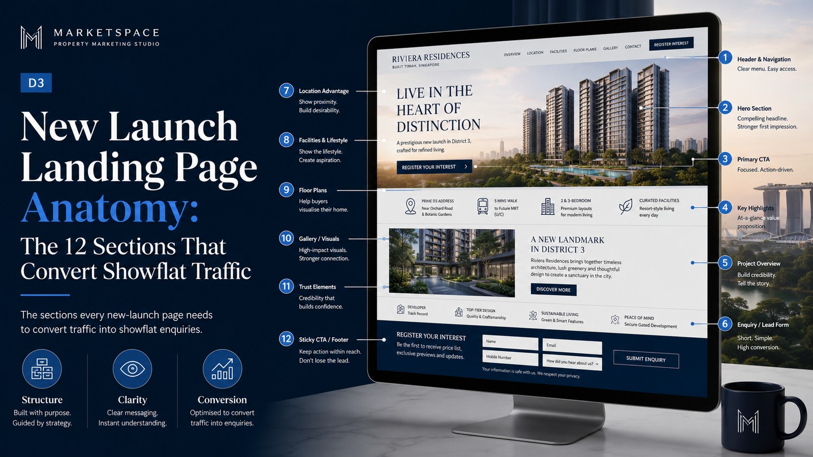
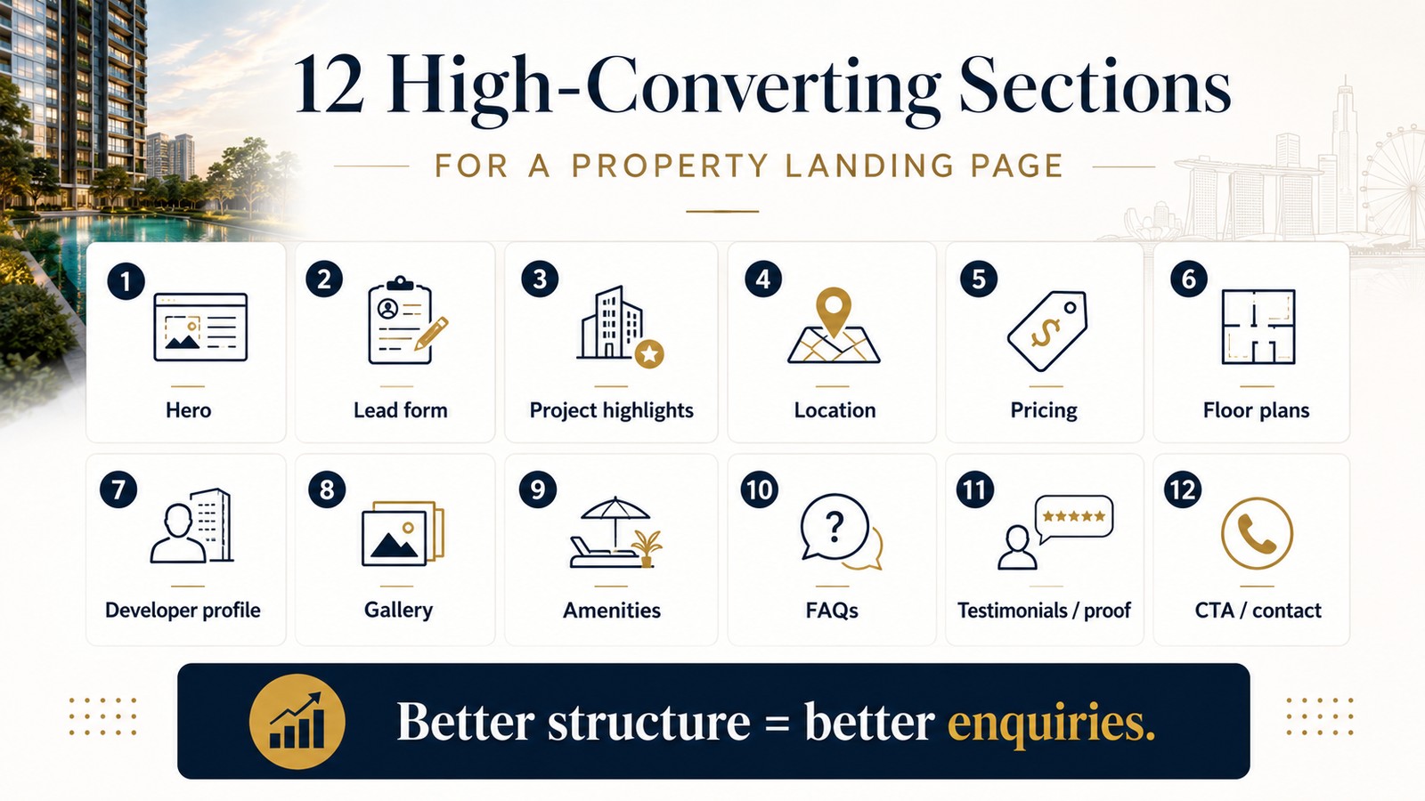
A high-converting property landing page has roughly 12 sections, in a deliberate order, each doing one job: grab attention, build trust, answer objections, and capture the enquiry. Most agent pages get the order wrong — they bury the call to action and lead with a logo instead of the property. Below is the full anatomy, top to bottom, so you can build (or audit) a page that turns showflat-style traffic into booked viewings.
Two agents send identical Google Ads traffic to two pages. One page converts at 2%, the other at 9% — same budget, four times the leads. The difference isn't the property or the price; it's the structure. A landing page is a sequence of decisions you guide a visitor through, and the order matters as much as the content. Get it right and the page does the selling.
Here are the 12 sections, in order.
01 The 12 sections, top to bottom
- Hero. The best image, the property's one-line value statement, and a call to action visible without scrolling. This is 80% of the decision to stay or leave.
- Trust strip. Immediately below the hero — your name, photo, agency, CEA registration, a key proof point ("47 D9 transactions"). Establishes you're real and credible.
- Key facts block. Size, tenure, price, bedrooms, what's included — scannable in three seconds.
- The story. What the portal can't tell: why this home, the layout logic, renovation, the lifestyle. Emotion sells; specs justify.
- Gallery. A proper set of high-quality images, ordered to tell a journey through the home.
- Video / virtual tour. The single biggest engagement lift for higher-value property — let buyers walk through before they visit.
- Location and amenities. Map, schools, MRT, what's nearby — answer "is this the right area for me?"
- Social proof. Testimonials, past results, or recent transactions that build confidence in you.
- Objection-handling FAQ. The real questions a buyer hesitates on — financing, ABSD, timeline, condition. Answer them here and remove friction.
- The agent block. A proper introduction to you — why you're the right person for this property and this buyer.
- Primary call to action. Book a viewing, prominent and repeated. Make it effortless — a tap to WhatsApp beats a long form.
- Sticky contact. A persistent WhatsApp or call button so the buyer can act the instant they're ready, from anywhere on the page.
02 Why the order matters
The sequence mirrors how a buyer decides: is this worth my attention (hero) → can I trust this person (trust strip) → does it fit my needs (facts, story, location) → what's stopping me (FAQ) → how do I act (CTA). Put the FAQ before the gallery and you answer objections the buyer hasn't formed yet; bury the trust strip and they doubt you before they're interested. Order is structure, and structure is conversion.
The above-the-fold rule
Most visitors decide to stay or leave in the first few seconds, before scrolling. So your hero must carry three things at once: a compelling image, a clear value statement, and a visible call to action. If a buyer has to scroll to learn what the page is even about, you've already lost most of them.
03 The call to action: make it frictionless
The most common conversion killer is a hard ask. A ten-field form scares people off; "Book a viewing" via a single WhatsApp tap converts far better in Singapore, where WhatsApp is the default. Repeat the CTA at natural decision points — after the gallery, after the FAQ, and keep it sticky — so the buyer never has to hunt for how to act.
04 Speed and mobile are not optional
Most property browsing in Singapore happens on a phone, often late at night. A page that loads slowly or breaks on mobile loses buyers before any section gets a chance to work. Fast load, clean mobile layout, tap-friendly buttons — these are prerequisites, not polish. A beautiful page that takes six seconds to load converts worse than a plain one that loads instantly.
05 Audit your own page
Run your current page against the 12 sections. The usual gaps: no trust strip, the CTA buried below the fold, no FAQ, no video, and a form that asks for too much. Fix those five and most agent pages convert meaningfully better — same traffic, more viewings.
To put this page to work, see the new launch playbook for the traffic system, and the 9 conversion killers for the mistakes that quietly sink even a well-structured page.
Free campaign blueprint
Send us your landing page URL and we'll record a short teardown against the 12-section anatomy — what's missing, what's out of order, and the three fixes that would lift conversion first.
Request a free blueprint →